
A FREE PRESS NEEDS YOU
A Poster that informs and promotes Free Press. Freedom of the Press, protected by the First Amendment, is the principle that communication and expression through various media should be considered a basic human right to be exercised freely.
DURATION
3 Weeks
MATERIAL
Photography
DIMENSION
16 in x 22 in
CONTEXT
In 1798, Thomas Jefferson famously wrote to a friend,
"Were it left to me to decide whether we should have a government without newspapers, or newspapers without a government, I should not hesitate a moment to prefer the latter."
Twenty years after, he was less sure of its value. He wrote,
"Nothing can now be believed which is seen in a newspaper."
The trust between journalists and people have been further broken apart in recent years. People insist that truths they don't like are "fake news", and call journalists the "enemy of the people". These attacks on the press are particularly threatening to journalists in the nations and the democracy of the United States.
For this project, we are asked to design a poster incorporated an editorial statement that can remind people of the purpose and importance, raise awareness of particular issue related to, and call for action to support Free Press.
IDEATION
Initial Brainstorming

To start, I first chose a powerful editorial statement that I wanted to incorporate into the poster:
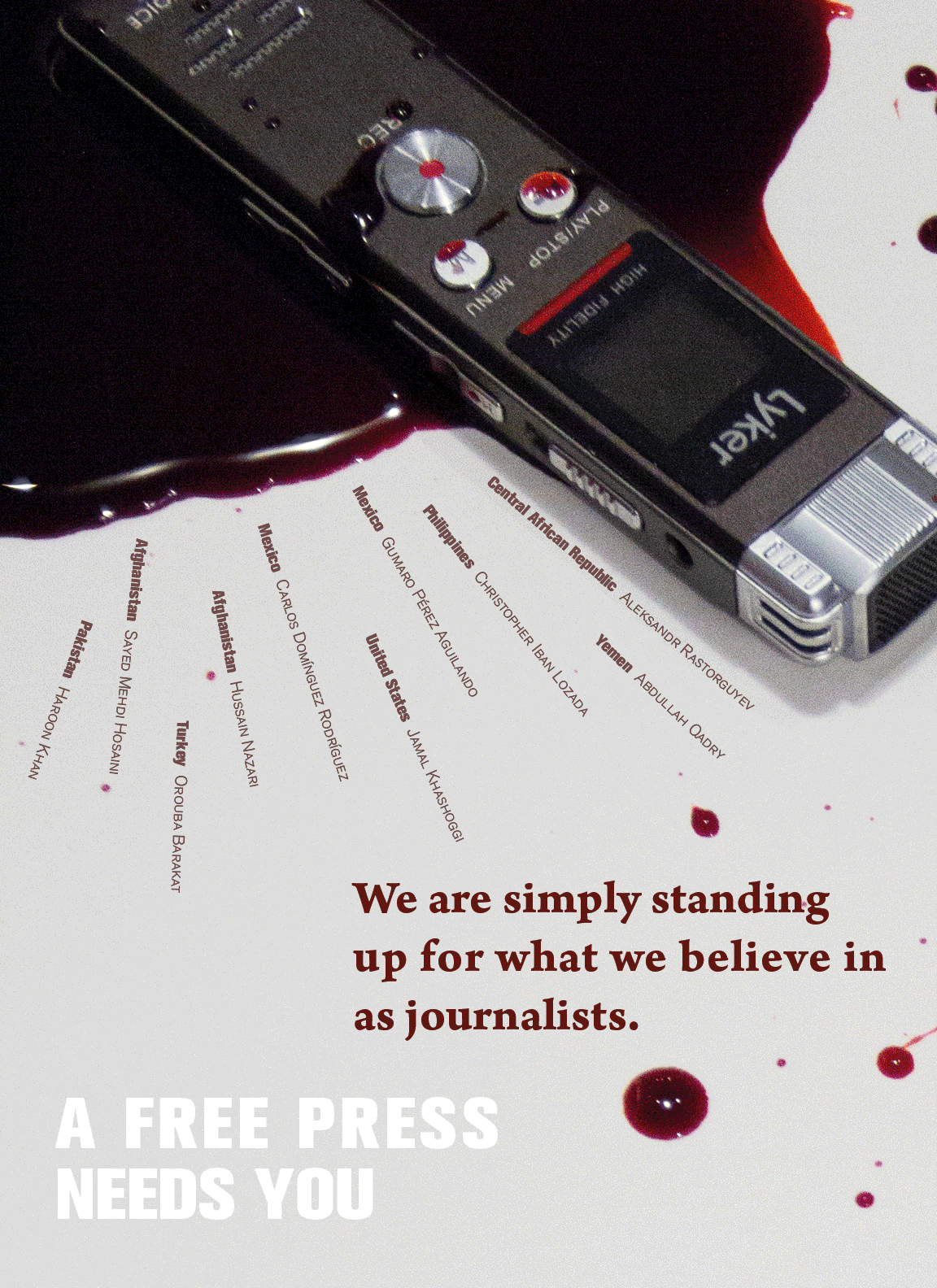
"We are simply standing up for what we believe in as journalists."
After selecting the statement, I thought about how to relate the image to the quote by making a brainstorm map. Through the map, I came up with FIVE directions that I could approach the poster, as well as the symbols representing journalists. From the five big ideas, I chose three to further experiment.
DESIGN PROCESS
First Round of Variations
I used "Adobe Sketch" to quickly prototype my initial ideas. By using mainly illustrations and photos online, I showed the concept for each poster quickly in order to receive critique if there was any works better.

Blindfolded journalist typing the "truth" he thinks he knows

Bloody items showing
the severity of the issue.

Journalists seem to be small but in fact powerful when typing
While I was deciding which direction to go to, the news that Jamal Khashoggi, a Saudi journalist had been assassinated broke out. I was shocked and deeply affected by the fact that in today's society, there were still journalists out there, risking their lives, trying to bring the fact they saw to people. Therefore, I chose to proceed with the second idea, using blood and objects representing journalists to show the severity of the issue.
Second Round of Variations


Variation 1
Process Photo

Variation 2
For these two variations, I changed illustration style to photography because the real photos gave a more realistic and serious feeling. I experiment with different backgrounds: newspaper and plain, as well as objects representing journalists: a pen and a recording device. I used red texts and positioned them aligned with the spreading blood, making them look like part of the blood.
Critiques I received were: people liked the plain background
because of the simplicity. However, the poster looked too bloody and thrilling.
Third Round of Variations

Less blood

Add the names of
dead journalists

Dark red for the names
Inspired by "30 10 5ft Rule", I tried to create the effect that every time the audience getting closer to the poster, they would discover something new. Therefore, I reduced the use of blood, making it less thrilling. I also added the names of the dead journalists, positioning them like blood spreading out. What's more, I experimented with different colors of the type. I made the title two colors so the audience would first notice "Needs You" from far away, and when they get closer, they would see it is "A Free Press" that needs you.
Fourth Round of Variations


However, the blood still seemed to be too much. Therefore, I made the blood even more subtle. I played with the position and font of the quote. I also tried different compositions of the recording device using cropping. The challenges I had were:
1. How to make the blood less thrilling?
2. How to highlight the object is a recording device which represents journalists?
After the critique, I decided to make variations upon the last layout because the recording device was large enough that the audience could clearly see the recording button.
Fifth Round of Variations
Different variations

Final submission for the project
For these variations, I tried different positioning of the type. I used the blood drop as bullet points for the names of the dead journalists. I also tried a different recording device with microphones, wondering if this would work better. The right one was the final version I submitted for the project.
REVISION
However, after submission, I felt like it seems like there are not many died because of the issue. Therefore, I decided to revise the poster.
I added an opaque layer on the background and manually typed the names and countries of journalists who died from 2012 to 2018, creating a monument feeling.
What's more, I felt the previous poster lacking type hierarchy because the block size of the editorial statement and the title is too similar. Therefore, I increased the font size and broke the quote into three lines, making it larger than the title so the audience would first see the quote, then the title.
Below is the final poster.
